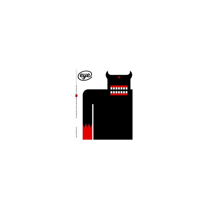
Eye 62 Vol16 Winter 2006
Eye Magazine issue 62 -
From the contents pages of Eye no. 62 vol. 16 Editorial by John L. Walters
- 01 Visual contents
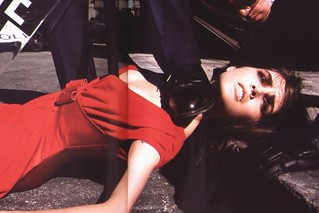
- 02. Critique. Torture chic. Vogue’s fusion of high fashion with brutish behaviour besmirches readers
- by making abusive images acceptable, even mundane. By Rick Poynor
- 04 Picture. Alan Fletcher. Remembering a graphic artist. Alan Fletcher’s editorial design was informed by craft skills and a highly original way of thinking. By Richard Schlagman
- 06 Common knowledge. Mexican wrestlers. Violent vaudeville. By Wayne Ford
- 18 Profile. Eric Olson. Practice and Process. In a short time, this highly focused type foundry has won acclaim and high-profile clients. By Deborah Littlejohn
- 26 Inspiration. Eric Gill’s essay. Visions of Joanna. For the first edition of ‘An Essay on Typography’, Eric Gill used his new serif font in the manner of a scribe. By Mark Thomson
- 30 Archive. Nazi type. Gothic horror. The Nazi party’s obsession with cultural dominance extended far into calligraphy, lettering and type. By Steven Heller
- 38 Essay. Electronic type. Electrifying the alphabet. Technological advances at the dawn of the computer age required new visions for type design By Sarah Owens
- 44 Type design. Swash caps. Back with a flourish. A taste for ornamentation and 1970s kitsch has led to a revival in the swash, the ‘tea cosy’ of typography. By Christian Schwartz
- 50 History. Motif magazine. The world made visible. Ruari McLean's magazine was a quirky mix of art and illustration, with its roots in graphic art and typography. By Rick Poynor
- 6 Report. Character design. Emotion graphics. Is character design a fount of rich, contemporary visual codes . . . or just a cop-out for over-stressed kidults? By Jody Boehnert
- 73 Uncoated. Letters. Monitor (Here be monsters). Agenda (Artspeak). Reviews. Books received. Colophon. See Uncoated contents, page 73
| Weight | 0.684000 |
|---|---|
| Binding | Magazine |
| Pages | 88 |
| Date Published | 2006-12-07 00:00:00 |
| ISBN13/Barcode | 9770960779056 |
|---|---|
| Publisher | Central Books - magazine back issues |
Eric Olson / Process
Nazi type
Swash caps
Motif magazine
Character design
Opinion
Vogue’s fusion of high fashion with brutish behaviour besmirches readers by making abusive images…
A piece of design is the expression of an idea. It’s not a solution
Control too much and it will appear we have something to hide
How did ‘Art bollocks’ become the default way of writing about visual culture? Could Mao have the…
Features
Is character design a fount of rich, contemporary visual codes . . . or just a cop-out for over-stressed…
The Nazi party’s obsession with cultural dominance extended far into calligraphy, lettering and type
In a short time, Eric Olson’s highly focused type foundry has won both peer acclaim and high-profile…
Motif, edited by Ruari McLean, was a quirky mix of art and illustration, with its roots in graphic art…
For the first edition of ‘An Essay on Typography’, Eric Gill used his new serif font in the manner of…
A taste for ornamentation and 1970s kitsch has led to a revival in the swash, the ‘tea cosy’ of…
Alan Fletcher’s editorial design was informed by craft skills and a highly original way of thinking
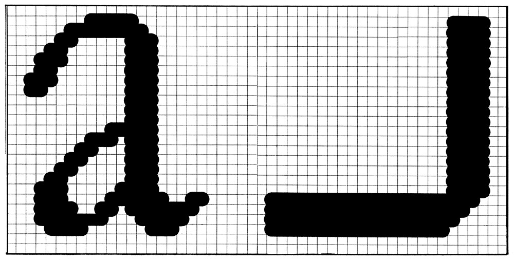
At the dawn of the computer age, new functions ushered in new forms for type design
In a world crammed with pictures, both art directors and agencies are compelled to rethink their roles
The signage design for Carlsbad, New Mexico, an underground site to be sealed until the year 12,000 AD…